Case Study
As Within, So Without
Designing a 212-Page Illustrated Book for a Decades-Long Investigation
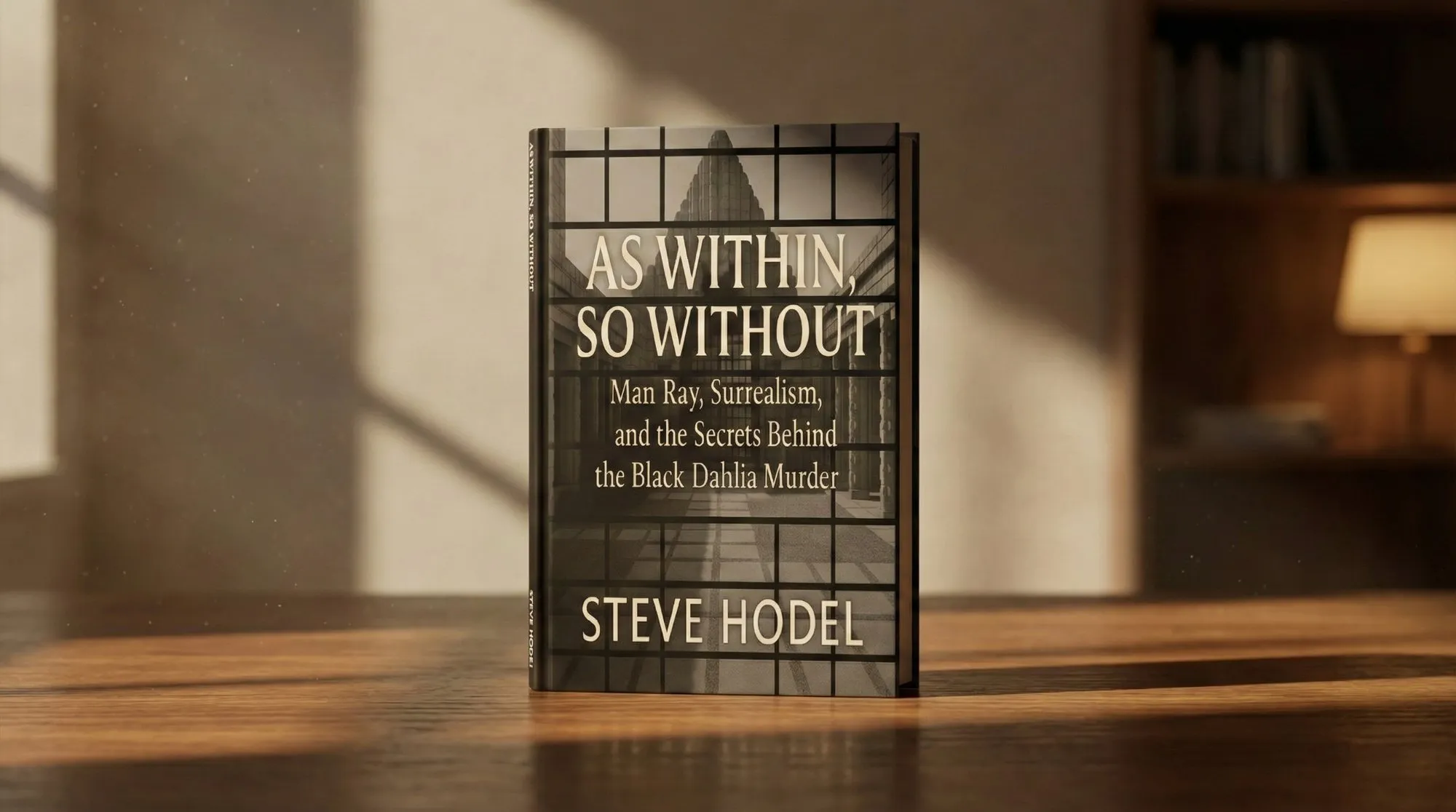
Key Impact
212 pages · 130+ archival images placed and captioned · Print-ready for paperback and hardcover on Amazon
The Brief
Where They Were
Steve Hodel is a former LAPD homicide detective. After he retired, he spent decades investigating his own father, Dr. George Hodel, whom he believes was behind the Black Dahlia murder. As Within, So Without follows that investigation into the surrealist art world his father moved in.
What Was Broken
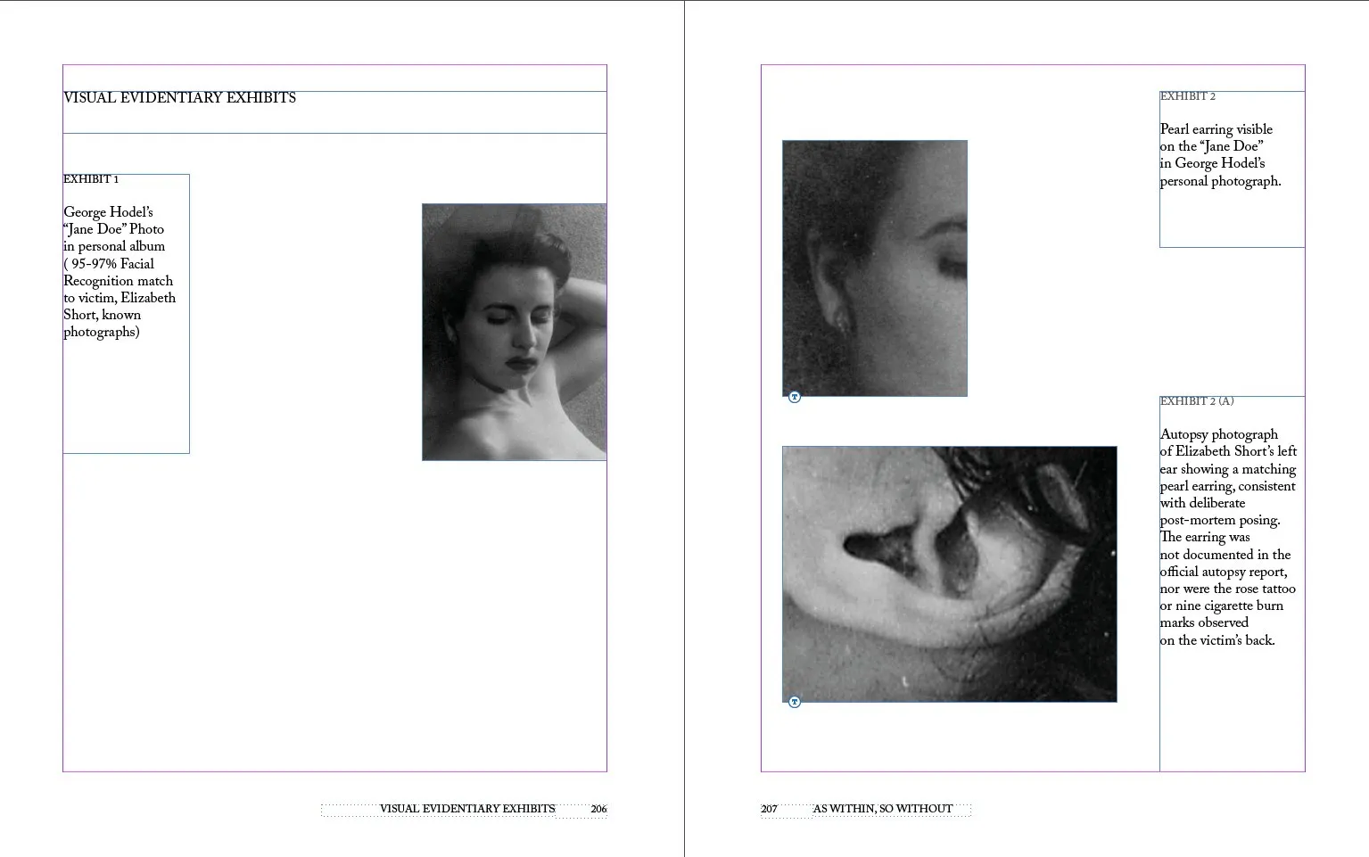
The manuscript carried decades of research: records, letters, photographs and artworks, more than 130 images in all. It had to read as a serious book, not a case file, and every image had to sit next to the passage that explains it.
What We Had to Work With
Many images were old scans of uneven quality. The book had to meet Amazon's print specifications for paperback and hardcover in full colour, and the text kept changing across several rounds of edits.
The Turn
What I Saw
This is a book about art as much as about a crime. A modern true-crime look would have undercut its own argument. It had to look like it came from the period it describes.
The Idea
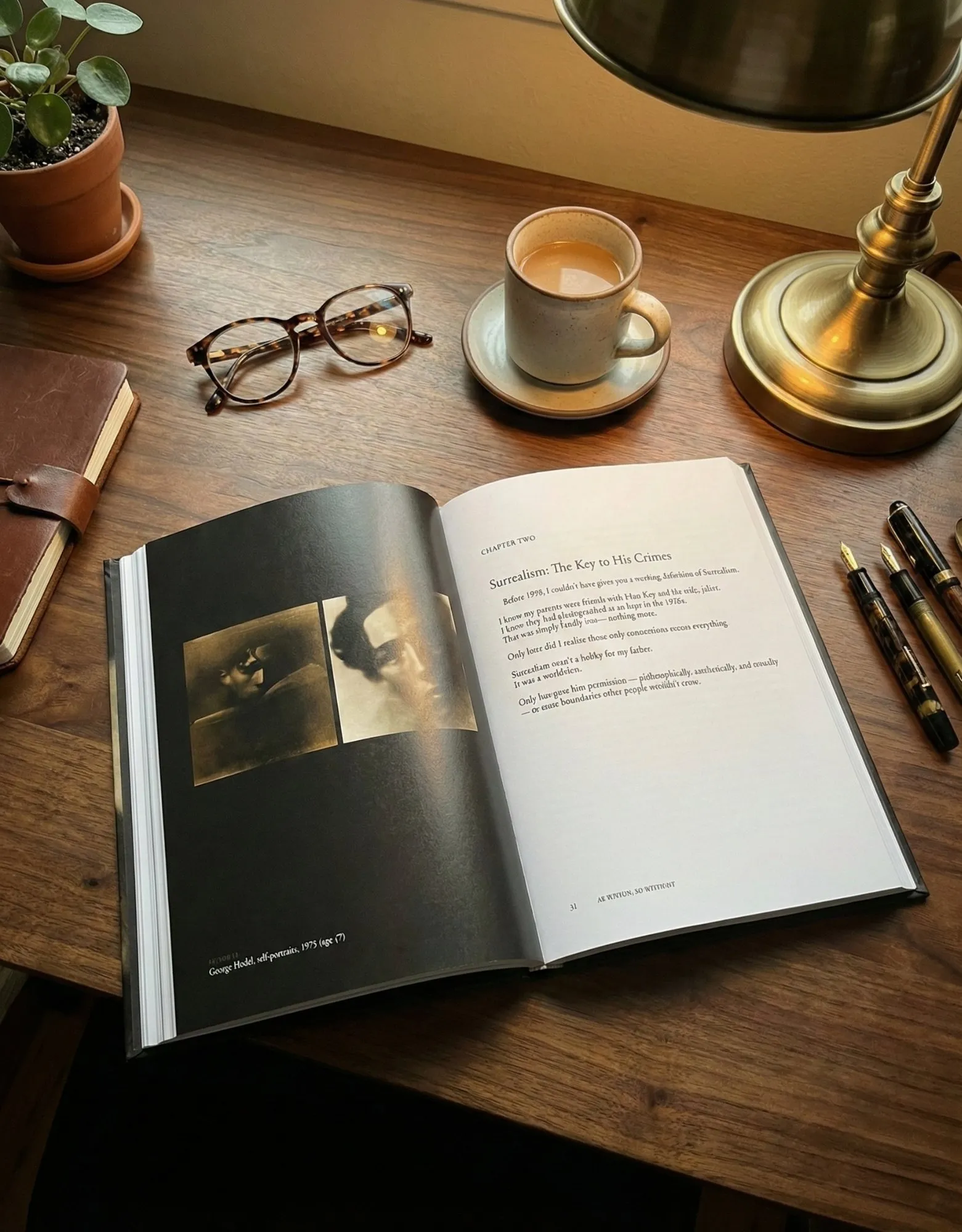
I read the manuscript and Steve's earlier books first. Then I studied how the art world of the 1930s and 40s talked about itself in print: the catalogues, the magazines, the typefaces and the way pages were built around images. Adobe Caslon carries the text. It has the weight of that period and stays easy to read over 212 pages.
The Calls I Made
Images are treated as exhibits. Each one is anchored to its paragraph, captioned the same way and given the same frame, so a reader can check a claim against the picture without flipping pages. The type stays quiet: one serif family, a strict grid and generous margins, so the material does the talking.
How I Led It
I was the only designer, so the leadership here was with the author. I kept Steve involved at every stage, explained each decision in terms of how a reader follows the evidence, and coordinated image restoration and structural changes across rounds without breaking the layout.
The Work
Reading & Research
Read the manuscript and Steve's earlier books, then studied the printed matter of the period the story moves through.
Type & Grid
Chose Adobe Caslon for its period character and readability, and built a strict grid with master pages for chapters, exhibits and notes.
Exhibits & Images
Placed more than 130 images as anchored figures with consistent captions, and coordinated restoration of the weakest scans.
Production
Prepared print-ready files for paperback and hardcover in full colour, through several rounds of structural edits.
What Changed
- A 212-page full-colour interior, typeset and print-ready
- 130+ images placed, captioned and coordinated through restoration
- Prepared for paperback and hardcover, now on sale on Amazon
- A long-term working relationship with a New York Times bestselling author
“Very professional work and his continual ongoing communications and proffered insights were invaluable. I highly recommend him.”
Looking Back
It's the project I'm proudest of. A man spent most of his life trying to put a hard truth on the record. My job was to make that record clear and credible, and to let the design language of the period carry it.
Book Design & Typesetting: Amr Abu-Talleb · Author: Steve Hodel